Category Archives: Uncategorized

Why WebOps (From Pantheon, A Sponsor of WordCamp Miami)

By: Steve Persch, Technical Product Marketing Manager

If you read much of the Pantheon blog, you almost certainly have noticed a word we are using a lot lately: “WebOps.” Pantheon co-founder and Head of Product Josh Koenig says, “Your Website is Your Results Engine. Keep it Tuned with WebOps.” Our CEO Zack Rosen says that WebOps is the key to getting unstuck. I even wrote about how you can avoid WebOoops with WebOps.

We think WebOps as a term helps tell the story of cross-functional web teams. For us, it passes the Goldilocks test. It is not too small, not too big. WebOps is just right. And it’s a concept we have built toward since our founding.

“Hosting” Is Too Small

Often when I travel to WordPress and Drupal events, the attendees ask me how Pantheon is different from other hosts. They want to comparison shop storage, memory limits, and price. That’s a really limited view of what teams do with Pantheon. Our CEO, Zack Rosen wrote back in 2013:

Pantheon is not hosting. In the same way your smartphone isn’t really a phone but an internet connected pocket computer with a phone calling app. Yes, Pantheon hosts Drupal sites, but it is architected completely differently and built to do much more. 

As a WebOps platform, Pantheon enables web teams to drive value with their websites. Sure, that includes having a place to host the live website. But it also means supplying a git-backed pipeline to move through Dev, Test, and Live environments. It means an easy way to spin up disposable new environments to do feature branch development. It means performance monitoring, HTTPS at the edge, and disaster recovery, all baked in. A team using Pantheon does not need to re-answer these questions with every project. We implement these features in a standardized way for every site using them. “Hosting” is just a fraction of the picture.

“DevOps” Is Too Big

The wide world of DevOps has answers for Internet of Things gadgets, iOS apps, machine learning, and much more. Of course, the management of websites can fit comfortably under the umbrella of DevOps. But teams focused entirely on delivering business value through the web, specifically, should have an ecosystem and a culture that acknowledges that constraint. For example, technologists practicing DevOps might expect to pick which Linux distro is best for a given use case. Practitioners of WebOps will build on a platform like Pantheon that abstracts that problem away.

When I was working as an agency developer for clients with a limited budget, I did not want to spend a single billable hour on Ubuntu vs CentOS, or NGINX config, or backup scripts. I liked the vision of “Website DevOps” that Josh Koenig sketched out in 2015. Now, we call that “WebOps.”

“DevOps” Doesn’t Encompass the Whole Web Team

Josh ended that 2015 blog post with a prediction:

I predict that the definition of “technical organization” will continue to expand, encompassing more and more departments, groups, and companies. Marketing is getting technical, as are marketing-oriented agencies. They all have a lot to gain from adopting a DevOps mindset.

I think that prediction holds up really well! The vision of WebOps we are building now includes marketers, site owners, designers and more. And we think we need a word other than DevOps to fit them in. In my observation, much of the DevOps community views roles beyond the  “Developer” and “System Operator” as outside of DevOps. Business stakeholders are important, but separate. Sometimes the word will even get expanded to include single extra roles like DevSecOps to include a “security” role.

At Pantheon, we think the set of roles in a WebOps culture is flexible, and that it includes business stakeholders. In my own recent WebOps blog post, I wrote:

WebOps brings together developers, designers, marketers, content editors and more. Everyone whose job it is to change the website in significant ways (the code, the visuals, the content, the measurements of success) needs to think of themselves on the same team and working towards the same goals.

Concretely, if your team does daily stand ups, then you should not often have to go outside that meeting to get a decision or know whether a proposed change is feasible. The people changing the website are represented in that group.

WebOps Wins

We want to focus the WebOps conversation on cross-functional teams because we have seen people get lost in the shuffle. “Hosting” can be a race to the bottom where price is paramount and value is lost. “DevOps,” at its best, is an empowering cultural movement that frees people to do great work. That can be hard to see if you are neck deep in a mess of config files and failing builds. With “WebOps,” we maximize our chances to make good on the offer in the very first blog post on pantheon.io, that we want to put the human at the top of the stack.
Top Ten Things New Speakers Should Remember

By David Bisset

I’m David and along with being a remote developer, I also have been involved in speaking and organizing meetups and conferences for the past 15 years. You come to appreciate that these events, especially when they are open and welcoming, help communities grow and thrive.

Speakers play a big part in sharing stories and knowledge, sparking new thoughts in the minds of their listeners, and sparking conversations in the community. But for those eager to share but timid because they are new or not as experienced, it can be a challenge.

As a result, here are some things I would like to share that have helped me and others as we have given talks to crowds of all sizes and types throughout the years – a list that even “experienced” speakers use as reminders.

I hope it’s of some benefit and take comfort that by speaking you are benefiting your community and you have the support of others who are also bravely doing the same.

Top Ten Things New Speakers Should Remember:

  • Practice makes perfect but don’t over do it. If it makes you feel better have a script in your notes in the presenting app if possible but aim to be comfortable enough not to have read from them constantly. But feel nice you have something to fall back on if your mind goes blank.
  • Get honest feedback from friends, family, your local meetup or anyone you feel comfortable with. Don’t wait until you are completely done with your presentation. Depending on the subject, get feedback from friends and the community about your subject – you might find a particular angle or point that is worth bringing up. Record yourself giving the presentation and examine the video afterwards (some even listen without the video to focus on the audio). 
  • Strive to make slides high enough contrast and large enough font for those not sitting in the front row to be able to read it comfortably. Don’t stress on having fancy designs or cute animated GIFs – clear and easy to read slides that stress the main points of your talk have a longer shelf life.
  • Confirm with conference organizers if someone will be recording your talk and taking photos. You’ll want this later for personal and promotional purposes. Don’t wait until after your talk to ask these! Ask a good friend or (worse case) fellow conference attendee
  • Have a backup of your slides on a USB drive you bring with you (having an online backup doesn’t hurt and could be faster to pull up potentially but always bring a physical backup).
  • If your talk needs Wi-Fi for some reason (demoing a website) plan for the unfortunate scenario if internet isn’t available. Have a backup plan (perhaps a screenshot or a video recording of whatever you were about to do live).
  • Confirm with conference organizers about Wi-Fi, power, and adapters that might be needed. Even if they claim to have all of that available, plan just in case they don’t. Have your own adapter or dongles for your laptop. Even if they have an adapter sometimes, they don’t (well) with all laptops.
  • If you are concerned about ending on time – especially if you plan on taking questions – figure out a way for you to be alerted comfortably as you speak. Some use the trick of setting a phone vibrate alert. This might be useful even if there is a room moderator tracking your time or not.
  • Give thought when you want to share your slides. Often speakers upload this prior to the talk and share the URL in an opening or closing slide. Removes the “where can I find your slides” question. Also, you can tweet this information out (set a scheduled tweet to remind people near the close of your talk perhaps). Consider multiple formats for your slides (PDF, html) and even more than one language if it makes sense (part of a multi-language conference for example).
  • Relax. You should consider your first conference talk – no matter how much you practice – as a “practice talk”. In other words, don’t stress yourself out. Expect to make mistakes (seasoned speakers make lists of things after many of their talks). Setting proper expectations might help you dealing with stress and imposter syndrome before, during, and after the talk. But you have a story to share. You got this.

How to Design Your Presentation Slides

By Louise Treadwell

Using Color Contrast to Make Your Presentation Slides Accessible 

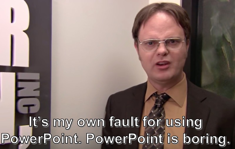
Dwight from "The Office" looking frustrated while saying "It's my own fault for using PowerPoint. PowerPoint is boring."

Your proposal was accepted, and you’ve been invited to give a talk at a WordCamp! Congratulations! Once you’ve finished doing a little happy dance, it is time to get down to business and start working on your slides. The gold standard for WordCamp presentations is to use Google Slides or PowerPoint (never mind what Dwight might think) or you can go further and be like Matt and use the WordPress 2020 theme! But regardless of what you use to build your slides, nothing matters if they aren’t clear, clean, and accessible.

The basic anatomy of an accessible presentation slide:

  • Make your slides available online at the start of your presentation so that users can download them and follow along
  • Use alt tags to describe your images, especially your infographics and memes
  • Use descriptive language for your links instead of “click here.”
  • User headers (H1, H2, etc.) to help users quickly navigate your content 
  • Use bullets to clearly designate your lists
  • Use standard fonts instead of overly creative ones 

Most of these issues are well-known, oft-discussed, and easily caught if you run the builtin accessibility checker provided inside of Microsoft’s PowerPoint. (You can find it under the “Review” menu header)

A commonly forgotten accessibility issue with presentation slides is color contrast. When there is not enough contrast between the color of your text and the color of your backgrounds, it can become difficult or even impossible for your audience to read your slides. Difficulty seeing color contrast is directly linked to color blindness, a condition that affects far more people than we realize. 

According to the National Eye Institute, “There are three main kinds of color blindness, based on photopigment defects in the three different kinds of cones that respond to blue, green, and red light. Red-green color blindness is the most common, followed by blueyellow color blindness. A complete absence of color vision —total color blindness – is rare.”

Milder forms of color blindness are underreported by users because often many don’t even know they have it. But as any graphic designer or web designer can tell you, the topic comes up often in design meetings when someone points out that a button on a page or a border is missing. Then the team erupts into a debate, not unlike the internet frenzy over “The Dress.” (I’m team “blue and black,” by the way) The issue is usually that the “missing” button or border is so close in color to its background that it is rendered invisible to some users. This problem won’t be reported by most users because how they can tell you something is missing if they didn’t know it was supposed to be there???

So, if users can’t report it, how do we know if our color contrast is problematic?  

Automated tools will tell us there is a color contrast problem but they usually don’t tell us explicitly how to fix it. (PowerPoint is guilty in this regard) The Web Content Accessibility Guidelines (WCAG) is a set of measurable and attainable benchmarks for achieving accessibility on the web. The WCAG has very precise rules for color usage. We can use those rules to help us create accessible presentation slides. Lucky for us, there are tools out there that are built to test those rules and help us make concrete design decisions. 

Here are two of my favorites:

  • WebAIM Contrast Checker – This online tool is very lightweight and straight to the point. Enter the HEX code for your foreground (text, borders, buttons) and then your background. The tool will immediately give you a “Contrast Ratio” and tell you whether your ratio meets WCAG standards. 
  • WebAIM Link Contrast Checker – This online tool, also from WebAIM, is specifically for verifying that the contrast of your links is distinct enough from the rest of the text around them. 

Want to dig deeper into this topic? Here are a few resources to get you started:

Louise is an eternal web development geek and social media junkie. She’s a native of Metro Detroit and an alumna of the University of Michigan. She learned about the human side of computer science while earning a Master’s Degree in Library and Information Science and has fined tuned her web developer skills over the course of a 20+ year career building, breaking, and fixing sites for a multitude of startups.

More Than A Presentation

Making the Most of Your Next Speaking Gig

By Andy McIlwain

Hi! I’m Andy. I’ve been a WordCamp and meetup organizer for the better part of a decade. In that time, I’ve seen a lot of presentations, covering a wide range of topics, from speakers at every experience level.

Presenting to a room full of strangers is an art. And as with any art, it’s largely subjective. A talk or session that resonates with you may fall flat with someone else.

It’s also a case of practice. The more you get up and speak, the sooner you’ll find a presentation style and approach that feels comfortable to you.

But I digress. I’m not here to get into the weeds on how to be a better presenter. Instead, I’d like to focus on all the things that happen around your session: before, during, and after.

Your presentation is like a Netflix series premiere

Think of a Netflix series premiere. The trailers and TV interviews and random YouTube videos with cast members raise awareness for the series. The series has an official hashtag that viewers can follow and add to on social. Then there’s all the reviews, breakdowns, articles, opinion pieces, social media posts, and group conversations that follow after the premiere.

Your presentation is an event, just like a Netflix series premiere.

Build some hype leading up to your presentation, get the anticipation and interest going. Give your audience something to participate in during the presentation. Then keep the conversation and activity going afterwards.

Sound good? Here are some ideas to help you pull it off.

Before your presentation

Toot your own horn: After you’ve been confirmed as a speaker, don’t be afraid to flex a little #humblebrag through your online presence. Are you on Twitter? Add a pinned tweet to your profile. Instagram? Drop a note in your bio. Blogging? Add a sticky post or widget. Heck, even drop a note in your email signature. Be proud! Link back to your speaker or session description so folks know where to find more information and — ideally — register to attend.

Curate related content: You’ll probably do a lot of research as part of your presentation prep. Don’t hoard these resources to yourself. Share the useful stuff you’re finding. Give a shout-out to the creators when you do. Who knows? They may help spread the word about your upcoming talk.

Write a companion post: Turn your one-time presentation into an evergreen resource that you, and others, can reference well into the future. I like to write a full post for each of my presentations because it helps me sort out my thoughts. Then, thanks to all the time I’ve spent chewing on the topic, my presentation feels less intimidating.

Present at meetups: Meetup groups are a fabulous way to get feedback on your ideas and work the wrinkles out of your presentation. Plus, most local meetup groups are always itching for new speakers. You could even think about chopping up a longer presentation (e.g. 45 minutes) into shorter “lightning talks” (e.g. 10 minutes). The meetup groups don’t need to be local, either; some groups have remote speakers present via video conferencing like Zoom.

During your presentation

Invite your audience to participate: The low-fi version of this is to ask questions, get a show of hands, or open the floor to questions throughout. This flips the audience from being passive observers to active participants.

Involve others: Those creators I mentioned in the previous section? The ones whose stuff you’ve leaned on for your presentation prep? Include them in your presentation. Drop quotes into your deck. Cite them by name. Reference their work as worthwhile resources. It doesn’t undermine your own expertise — if anything, it shows that you’ve done your homework. And, once again, we’re bringing other people into the conversation.

Point your audience to the companion post: The companion post you wrote before the presentation shouldn’t be shared until after you’ve done your presentation. It’s the perfect follow up to leave your audience with. Looking for notes? Looking for the slides?

Looking for additional resources? The companion post is the go-to destination for all of that.

After your presentation

Add your presentation to the companion post: Embed your presentation slides in the companion post and, if your presentation was recorded, embed the video as well. I probably sound like a broken record at this point, but I can’t stress it enough: your presentation’s companion post is the evergreen reference for all the work you put into your talk.

Reach out to the people you’ve leaned on: Again we’re hitting on the folks whose work you’ve used to put together your presentation. With your companion post live and presentation embedded within it, now’s the time to reach out directly. Thank them for the work they’ve done, tell them how it’s helped you, and point them to your post.

Open yourself up to further questions & conversations: Open post comments, embed a contact form, or link out to a discussion thread (e.g. in a Facebook group) where you’re taking questions about the topic you presented.

Your presentation is the icebreaker

If there’s one thing I can leave you with, it’s this: Your presentation doesn’t have to be a single moment in time. It can be so much more than just a PowerPoint deck in front of a room. It doesn’t have to end after your time is up.

Your presentation can be an opportunity to dig into a bigger topic or conversation. It’s one activity, one pulse, in a steady beat that can keep going long afterwards.

As a speaker, you’re in control of where to take it. More presentations? Videos? A course? A workshop? A book? You’re in charge. It’s up to you.

Good luck. You’ve got this.