2020 WordCamp Miami Speakers: Round Two


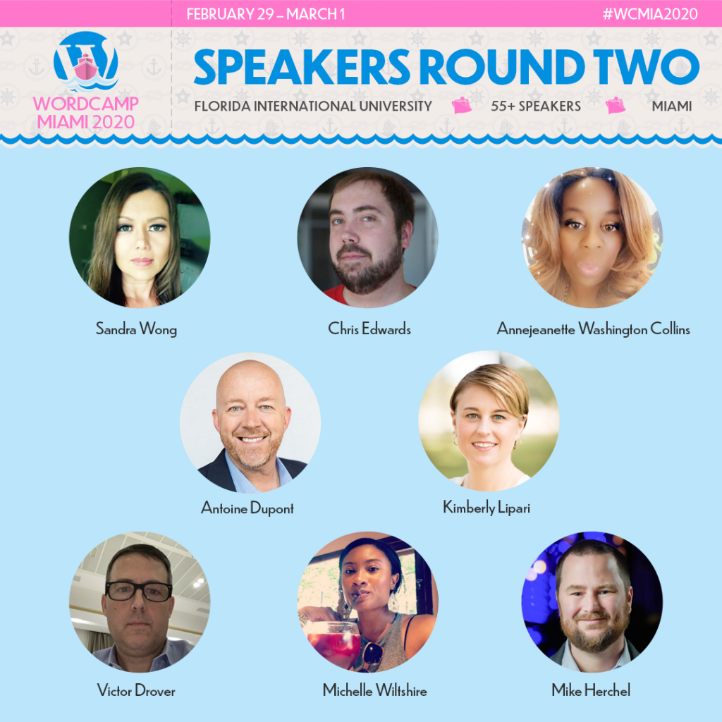
WordCamp Miami is happy to announce our second round of speakers and panelists for WordCamp Miami 2020.

SANDRA WONG

Sandra is a Program Manager at Magic Leap. She is also a Kanban trainer and coach. Some of her passions include facilitating workshops, supporting women’s groups, leading group meditations, doing Improv, blogging, volunteering, and challenging herself to learn and try something new everyday.

CHRIS EDWARDS

Chris is co-owner of Data Driven Labs, a WordPress Maintenance and Marketing agency. He is a 19-year Internet marketing veteran with experience in web design & development, search engine optimization, online marketing, social media marketing and mobile development. He is very active in the WordPress Orlando community and loves to help others learn new ways to grow their business. Chris has held development and Internet marketing positions in some of Orlando’s top technology companies.

ANNEJEANETTE WASHINGTON COLLINS

A 27-year educator in South Florida, Annejeanette Washington Collins combines Computer Science and STEM into everything she teaches both K-12 and collegiate levels. Annejeanette Washington Collins is a proud alumnae of the University of Miami and Nova Southeastern University. She teaches 5th grade at Manatee Bay Elementary and is a professor at The University of Fort Lauderdale. When she is not teaching, she serves as a volunteer with Black Girls Code (Miami Chapter), The Faith Center Ministries ( Sunrise, Florida), The Broward County Mayors Chess Challenge, Broward STEM Department, Dare to Care Outreach, DadsBeonDuty.com and volunteers at Sawgrass Springs Middle School. Her greatest moments in life are spent with her husband Major, her daughter Jayda Washington-Boothe ( 3 time Word Camp Miami Speaker), her family, and the beautiful South Florida beaches.

ANTOINE DUPONT

Antoine is a recognized expert and strategist in digital marketing.

He’s an award-winning marketing agency owner and a speaker at national & international conferences. He combines 18 years in marketing and 15 years in the hospitality industry.

His first job out of college was working for Gordon Ramsey in London at Le Gavroche. Antoine travels the world sharing his strategy and methodology to marketers and business owners. His goal is to improve lead generation and business growth via his proven marketing strategies.

As a result, he is an in-demand consultant on discovering the strategies that work.

KIMBERLY LIPARI

Kimberly is the CEO of Valet, a WordPress Management and Development Agency. She’s spent the last few years growing a business that focuses on service as a key selling point. Kimberly will share her firsthand and hard won knowledge of how support can make or break your business.

VICTOR DROVER

A self-taught web developer, Victor left a career as a Professor of Biochemistry to build websites with open source tools like WordPress. Having made and sold plugins for many years, Victor currently focuses on SaaS services for content management systems. When he’s not working in open source he spends his time travelling or coaching the girls rugby team at the High School near his home.

MICHELLE WILTSHIRE

Without boxing myself in too much, I describe myself as always curious, overly energetic, and a holistically inclined person. By night, I’m a licensed clinical psychologist with a small private practice and every other waking hour I’m a Product Designer of digital products. In 2017 I chose to evolve my career to include design and development with a focus on Front-end development. My everyday motivation is to bridge gaps between needs and resources. I feel inspired by tech and design’s ability to have a positive impact on a grander scale.

MIKE HERCHEL

Mike Herchel works as a senior front-end developer for Lullabot, and has been developing for the web for over 18 years. He’s passionate web performance, usability, and accessibility. You can often find him speaking on these subjects at web development conferences around the world.
2020 WordCamp Miami Speakers: Round One


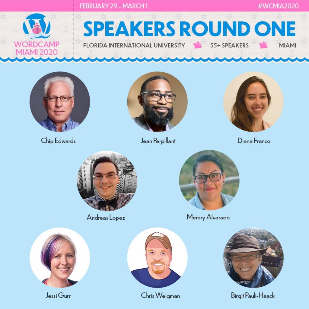
WordCamp Miami is happy to announce our the first round speakers and panelists for WordCamp Miami 2020.

MERARY ALVARADO

9+ years of proven experience in executing, development and leadership of QA processes in digital strategies for Fortune 100 clients. Experience as a Digital Accessibility Consultant establishing guidelines, best practices and standards related to designing and maintaining accessible websites, responsive sites, native applications, and digital documentation. Train clients on using accessibility monitoring software and assist in identifying Accessibility First strategies and solutions focus on innovating products, services, and projects.

Founder of Quality Assurance Costa Rica #QACR and Accesibilidad Web Costa Rica group in Facebook. Vice President of Society of Women Engineers (SWE) Costa Rica chapter and member of Asociación Centroamericana de Aeronáutica y del Espacio (ACAE) working on the Spatial Spin-off Initiatives in Latinamerica.

BIRGIT PAULI-HAACK

Birgit Pauli-Haack is the publisher of Gutenberg Times, a site with news around WordPress block editor and beyond. Birgit hosts regular Gutenberg Live Q & A on YouTube and co-hosts the podcast Gutenberg Changelog with Mark Uraine.

Birgit Pauli-Haack started working on websites in 1996 and has since then worked with publishers, artists, small businesses and nonprofit organizations. She founded Pauli Systems, LC in 2002, and leads a team of six dynamic online experts. Pauli Systems is a one-stop agency for web design, web publishing, online training and application development. Since 2010, her team has used WordPress to build new websites and web applications.

Birgit is a native German. When not in front of a computer, she runs, plays tennis, or hangs out with friends. She and her husband of 28 years love to travel and visit city art museums.

JESSI GURR

Jessi has been hand-coding websites since the day her dad brought home an AOL floppy disk in 1993. She started a website development company in 2005, and today runs a website development agency in Minnesota. A passionate entrepreneur, Jessi loves creating jobs, speaking about her experience growing a company, and sharing her experiences with freelancers and aspiring entrepreneurs. Jessi frequently speaks on business and management topics at local events and conferences throughout the US.

Jessi lives in Anoka, MN. When not running a business or chasing her two young children, you can find her in the vegetable garden or in the window seat of an airplane, traveling to her next adventure.

ANDREAS LOPEZ

Andreas first encountered Web Design back in Germany while taking Media Design classes where he learned HTML & CSS raw – no CMS, no aiding tools, just notepad and a cheat sheet of tags.

He moved to South Florida, US in 2012 where he became an IT Admin in 2013 and Webmaster by default at a small startup. This is when he used WordPress for the first time in a professional way. And from there on it was a deep dive journey straight into E-Commerce which is why he considers himself now an E-Commerce specialist & Accessibility Advocate.

He works full-time at a local business in West Palm Beach while building and selling Business, Gaming & Workstation PCs under his company ‘Omakase Consult’ – a hardware consulting & custom assembly company.

JEAN PERPILLANT

Strategy Architect for Design Theory. A small creative agency in business over 11 years based in Orlando, FL.

CHIP EDWARDS

Love’em or Hate’em, Smart Speakers like Amazon Alexa are being used by millions of people. Even more people are talking to their phones using Google Assistant and Apple’s Siri. Voice Technology is everywhere and is changing how people consume content. I’ve helped many well-known people like Seth Godin, William Jackson, and The Blind Blogger make their content available on Smart Speakers and Smart Phones using Voice Technology. If you’re interested in making your WordPress content available through Voice Technology, let’s talk.

CHRIS WIEGMAN

Chris is a Senior Software Engineer devoted to improving the developer experience for WordPress developers of all kinds. His work focuses on the intersection of development, privacy, ethics and usability of software and development to help improve the lives of everyone who uses the modern technology.

DIANA FRANCO

An accomplished Graphic Designer and Marketer from Bogotá-Colombia and now living in Miami, with demonstrated success implementing integrated marketing to create high-quality and engaging content. Creative, strategic, and analytical thinker efficiently implementing marketing tools to enhance user experience and to increase social media engagement. Founder of the community @Uxbestdesigns Created to 💆‍♀️inspire, 🤳🏻promote and 🤝connect with other UX/UI designers, marketers and researchers.

Top Ten Things New Speakers Should Remember

By David Bisset

I’m David and along with being a remote developer, I also have been involved in speaking and organizing meetups and conferences for the past 15 years. You come to appreciate that these events, especially when they are open and welcoming, help communities grow and thrive.

Speakers play a big part in sharing stories and knowledge, sparking new thoughts in the minds of their listeners, and sparking conversations in the community. But for those eager to share but timid because they are new or not as experienced, it can be a challenge.

As a result, here are some things I would like to share that have helped me and others as we have given talks to crowds of all sizes and types throughout the years – a list that even “experienced” speakers use as reminders.

I hope it’s of some benefit and take comfort that by speaking you are benefiting your community and you have the support of others who are also bravely doing the same.

Top Ten Things New Speakers Should Remember:

  • Practice makes perfect but don’t over do it. If it makes you feel better have a script in your notes in the presenting app if possible but aim to be comfortable enough not to have read from them constantly. But feel nice you have something to fall back on if your mind goes blank.
  • Get honest feedback from friends, family, your local meetup or anyone you feel comfortable with. Don’t wait until you are completely done with your presentation. Depending on the subject, get feedback from friends and the community about your subject – you might find a particular angle or point that is worth bringing up. Record yourself giving the presentation and examine the video afterwards (some even listen without the video to focus on the audio). 
  • Strive to make slides high enough contrast and large enough font for those not sitting in the front row to be able to read it comfortably. Don’t stress on having fancy designs or cute animated GIFs – clear and easy to read slides that stress the main points of your talk have a longer shelf life.
  • Confirm with conference organizers if someone will be recording your talk and taking photos. You’ll want this later for personal and promotional purposes. Don’t wait until after your talk to ask these! Ask a good friend or (worse case) fellow conference attendee
  • Have a backup of your slides on a USB drive you bring with you (having an online backup doesn’t hurt and could be faster to pull up potentially but always bring a physical backup).
  • If your talk needs Wi-Fi for some reason (demoing a website) plan for the unfortunate scenario if internet isn’t available. Have a backup plan (perhaps a screenshot or a video recording of whatever you were about to do live).
  • Confirm with conference organizers about Wi-Fi, power, and adapters that might be needed. Even if they claim to have all of that available, plan just in case they don’t. Have your own adapter or dongles for your laptop. Even if they have an adapter sometimes, they don’t (well) with all laptops.
  • If you are concerned about ending on time – especially if you plan on taking questions – figure out a way for you to be alerted comfortably as you speak. Some use the trick of setting a phone vibrate alert. This might be useful even if there is a room moderator tracking your time or not.
  • Give thought when you want to share your slides. Often speakers upload this prior to the talk and share the URL in an opening or closing slide. Removes the “where can I find your slides” question. Also, you can tweet this information out (set a scheduled tweet to remind people near the close of your talk perhaps). Consider multiple formats for your slides (PDF, html) and even more than one language if it makes sense (part of a multi-language conference for example).
  • Relax. You should consider your first conference talk – no matter how much you practice – as a “practice talk”. In other words, don’t stress yourself out. Expect to make mistakes (seasoned speakers make lists of things after many of their talks). Setting proper expectations might help you dealing with stress and imposter syndrome before, during, and after the talk. But you have a story to share. You got this.

How to Design Your Presentation Slides

By Louise Treadwell

Using Color Contrast to Make Your Presentation Slides Accessible 

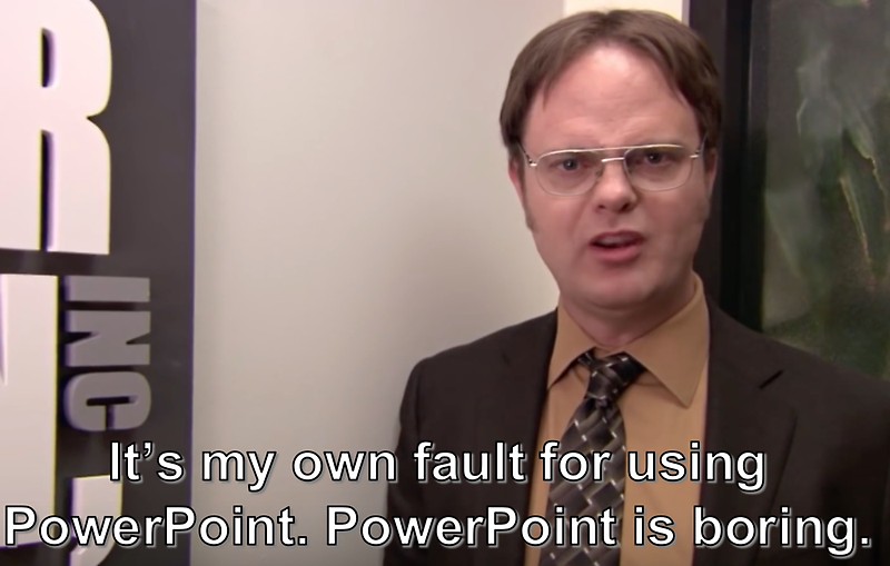
Dwight from "The Office" looking frustrated while saying "It's my own fault for using PowerPoint. PowerPoint is boring."

Your proposal was accepted, and you’ve been invited to give a talk at a WordCamp! Congratulations! Once you’ve finished doing a little happy dance, it is time to get down to business and start working on your slides. The gold standard for WordCamp presentations is to use Google Slides or PowerPoint (never mind what Dwight might think) or you can go further and be like Matt and use the WordPress 2020 theme! But regardless of what you use to build your slides, nothing matters if they aren’t clear, clean, and accessible.

The basic anatomy of an accessible presentation slide:

  • Make your slides available online at the start of your presentation so that users can download them and follow along
  • Use alt tags to describe your images, especially your infographics and memes
  • Use descriptive language for your links instead of “click here.”
  • User headers (H1, H2, etc.) to help users quickly navigate your content 
  • Use bullets to clearly designate your lists
  • Use standard fonts instead of overly creative ones 

Most of these issues are well-known, oft-discussed, and easily caught if you run the builtin accessibility checker provided inside of Microsoft’s PowerPoint. (You can find it under the “Review” menu header)

A commonly forgotten accessibility issue with presentation slides is color contrast. When there is not enough contrast between the color of your text and the color of your backgrounds, it can become difficult or even impossible for your audience to read your slides. Difficulty seeing color contrast is directly linked to color blindness, a condition that affects far more people than we realize. 

According to the National Eye Institute, “There are three main kinds of color blindness, based on photopigment defects in the three different kinds of cones that respond to blue, green, and red light. Red-green color blindness is the most common, followed by blueyellow color blindness. A complete absence of color vision —total color blindness – is rare.”

Milder forms of color blindness are underreported by users because often many don’t even know they have it. But as any graphic designer or web designer can tell you, the topic comes up often in design meetings when someone points out that a button on a page or a border is missing. Then the team erupts into a debate, not unlike the internet frenzy over “The Dress.” (I’m team “blue and black,” by the way) The issue is usually that the “missing” button or border is so close in color to its background that it is rendered invisible to some users. This problem won’t be reported by most users because how they can tell you something is missing if they didn’t know it was supposed to be there???

So, if users can’t report it, how do we know if our color contrast is problematic?  

Automated tools will tell us there is a color contrast problem but they usually don’t tell us explicitly how to fix it. (PowerPoint is guilty in this regard) The Web Content Accessibility Guidelines (WCAG) is a set of measurable and attainable benchmarks for achieving accessibility on the web. The WCAG has very precise rules for color usage. We can use those rules to help us create accessible presentation slides. Lucky for us, there are tools out there that are built to test those rules and help us make concrete design decisions. 

Here are two of my favorites:

  • WebAIM Contrast Checker – This online tool is very lightweight and straight to the point. Enter the HEX code for your foreground (text, borders, buttons) and then your background. The tool will immediately give you a “Contrast Ratio” and tell you whether your ratio meets WCAG standards. 
  • WebAIM Link Contrast Checker – This online tool, also from WebAIM, is specifically for verifying that the contrast of your links is distinct enough from the rest of the text around them. 

Want to dig deeper into this topic? Here are a few resources to get you started:

Louise is an eternal web development geek and social media junkie. She’s a native of Metro Detroit and an alumna of the University of Michigan. She learned about the human side of computer science while earning a Master’s Degree in Library and Information Science and has fined tuned her web developer skills over the course of a 20+ year career building, breaking, and fixing sites for a multitude of startups.

More Than A Presentation

Making the Most of Your Next Speaking Gig

By Andy McIlwain

Hi! I’m Andy. I’ve been a WordCamp and meetup organizer for the better part of a decade. In that time, I’ve seen a lot of presentations, covering a wide range of topics, from speakers at every experience level.

Presenting to a room full of strangers is an art. And as with any art, it’s largely subjective. A talk or session that resonates with you may fall flat with someone else.

It’s also a case of practice. The more you get up and speak, the sooner you’ll find a presentation style and approach that feels comfortable to you.

But I digress. I’m not here to get into the weeds on how to be a better presenter. Instead, I’d like to focus on all the things that happen around your session: before, during, and after.

Your presentation is like a Netflix series premiere

Think of a Netflix series premiere. The trailers and TV interviews and random YouTube videos with cast members raise awareness for the series. The series has an official hashtag that viewers can follow and add to on social. Then there’s all the reviews, breakdowns, articles, opinion pieces, social media posts, and group conversations that follow after the premiere.

Your presentation is an event, just like a Netflix series premiere.

Build some hype leading up to your presentation, get the anticipation and interest going. Give your audience something to participate in during the presentation. Then keep the conversation and activity going afterwards.

Sound good? Here are some ideas to help you pull it off.

Before your presentation

Toot your own horn: After you’ve been confirmed as a speaker, don’t be afraid to flex a little #humblebrag through your online presence. Are you on Twitter? Add a pinned tweet to your profile. Instagram? Drop a note in your bio. Blogging? Add a sticky post or widget. Heck, even drop a note in your email signature. Be proud! Link back to your speaker or session description so folks know where to find more information and — ideally — register to attend.

Curate related content: You’ll probably do a lot of research as part of your presentation prep. Don’t hoard these resources to yourself. Share the useful stuff you’re finding. Give a shout-out to the creators when you do. Who knows? They may help spread the word about your upcoming talk.

Write a companion post: Turn your one-time presentation into an evergreen resource that you, and others, can reference well into the future. I like to write a full post for each of my presentations because it helps me sort out my thoughts. Then, thanks to all the time I’ve spent chewing on the topic, my presentation feels less intimidating.

Present at meetups: Meetup groups are a fabulous way to get feedback on your ideas and work the wrinkles out of your presentation. Plus, most local meetup groups are always itching for new speakers. You could even think about chopping up a longer presentation (e.g. 45 minutes) into shorter “lightning talks” (e.g. 10 minutes). The meetup groups don’t need to be local, either; some groups have remote speakers present via video conferencing like Zoom.

During your presentation

Invite your audience to participate: The low-fi version of this is to ask questions, get a show of hands, or open the floor to questions throughout. This flips the audience from being passive observers to active participants.

Involve others: Those creators I mentioned in the previous section? The ones whose stuff you’ve leaned on for your presentation prep? Include them in your presentation. Drop quotes into your deck. Cite them by name. Reference their work as worthwhile resources. It doesn’t undermine your own expertise — if anything, it shows that you’ve done your homework. And, once again, we’re bringing other people into the conversation.

Point your audience to the companion post: The companion post you wrote before the presentation shouldn’t be shared until after you’ve done your presentation. It’s the perfect follow up to leave your audience with. Looking for notes? Looking for the slides?

Looking for additional resources? The companion post is the go-to destination for all of that.

After your presentation

Add your presentation to the companion post: Embed your presentation slides in the companion post and, if your presentation was recorded, embed the video as well. I probably sound like a broken record at this point, but I can’t stress it enough: your presentation’s companion post is the evergreen reference for all the work you put into your talk.

Reach out to the people you’ve leaned on: Again we’re hitting on the folks whose work you’ve used to put together your presentation. With your companion post live and presentation embedded within it, now’s the time to reach out directly. Thank them for the work they’ve done, tell them how it’s helped you, and point them to your post.

Open yourself up to further questions & conversations: Open post comments, embed a contact form, or link out to a discussion thread (e.g. in a Facebook group) where you’re taking questions about the topic you presented.

Your presentation is the icebreaker

If there’s one thing I can leave you with, it’s this: Your presentation doesn’t have to be a single moment in time. It can be so much more than just a PowerPoint deck in front of a room. It doesn’t have to end after your time is up.

Your presentation can be an opportunity to dig into a bigger topic or conversation. It’s one activity, one pulse, in a steady beat that can keep going long afterwards.

As a speaker, you’re in control of where to take it. More presentations? Videos? A course? A workshop? A book? You’re in charge. It’s up to you.

Good luck. You’ve got this.